-
Our solutions
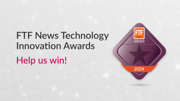
Vote for us in the following categories:
Vote for us!
20. Best Professional Services Provider
30. Service Provider of the Year
31. Software Solution of the Year- Our clients

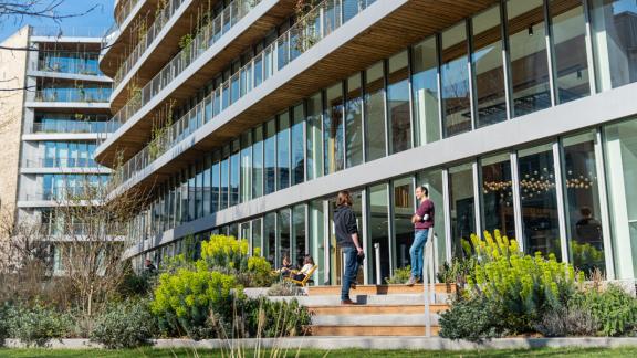
With 300 clients and 60,000 users spread across 60 countries around the world, Murex has a truly international client base of capital markets participants.
view all case studies- Who we are

Our awards highlight a strong level of customer satisfaction and acknowledge our market expertise.
Visit our awards webpage- Careers
DEC
07As Murex Adopts New Logo, Murex CMO Stella Clarke Explains the Evolution
Discover why Murex updated its visual identity

PARIS, December 7, 2020 — Murex CEO Maroun Edde and Chief Marketing Officer Stella Clarke led the team that engineered the redesign of Murex’s distinctive logo, which has been part of the company identity for over 20 years. She explained some of aesthetic and symbolic choices behind the evolution, which features a tighter “M” with a more vivid color that retains the movement and curvature of the previous iteration.
Walk us through how Murex launched on this visual identity refresh.
Murex is attached to the core of its visual identity—a calligraphic “M” tracing back to the early days of Murex. It evolved as we entered into the 2000s to accompany the launch of Mx G2000 and to mark our leadership in the enterprise capital markets platforms space. We began thinking about this transition over two years ago, as we discussed a brand refresh.
We wanted to revitalize a logo that had served us well for years, but could adopt a more current feel—our old logo began to show its age. We needed a logo poised, almost like a sprinter, to take the first charged strides into Murex’s future, while retaining its former character. <>
We were not interested in a major shift in our visual identity. From the beginning, we had a clear direction: the logo would undergo an evolution, not a revolution. This evolution was possible by the contribution of Maroun as he was also invested in creating the beloved logo that was part of our identity for 20 years.
What did an “evolution” mean?
For us, the evolution was all in the details. And the timing was right.
It meant “shortening” the long tail and an overall modernization.
The redesign tackled the signature “M” and the Murex wordmark. We removed the “stacking” of the “M” above the text itself. We wanted something more easily translatable to web and mobile.>
On the issue of the “M”: we were attached to its movement and curvature. Keeping that reference was important.
What other details about the new visual identity are notable?
In the redesign, you will notice the lines of the logo are thicker and the tail is shorter—it is a more controlled and measured representation of the feeling of movement, of a signature locked in muscle memory, easily executed, almost automatic. The typeface of the wordmark was also altered. It is a slightly modified version of the Brandon font. It has a cleaner, wider, rounder feel than more rectangular font that preceded it. It remains all caps and has a more balanced, strong form. The font size is bigger. Previously, the text was a much more secondary element. We liked that the M in Brandon mimics the curvature and movement of the logo’s M.
The result is a more balanced hierarchy between the logo and the wordmark, a more contemporary font, a more striking color dynamic, and an M that fits better everywhere, while retaining its gestural form.
With this brand evolution, Murex is entering an exciting new year with a strong revitalized look.
Latest news
FEB
29Murex Leads Financial Institution Energy Risk Management in Chartis Research Energy50 Report
see moreDEC
12Murex Expands Model Validation Offering with Financial Information and Analytics Leader
see moreNOV
29Murex Wins Technology Vendor of the Year and Three Risk Market Technology Awards from Risk.net
see more - Our clients